Bar Chart Race - Bollywood Singers
Bar chart races have lately become a popular form of visualization. This post is all about generating a bar chart race from scratch involving an interesting data extraction process. We will generate the bar chart race for the most popular singers Bollywood has had between the years 1933 and 2020. We will directly parse data from Wikipedia. Using nested loops, we will first iterate through the list of years, then through the list of films across a given years and then skim through each film’s page. We will extract data using beautifulsoup and pandas and use matplotlib animation to generate the bar chart race.
Data Extraction
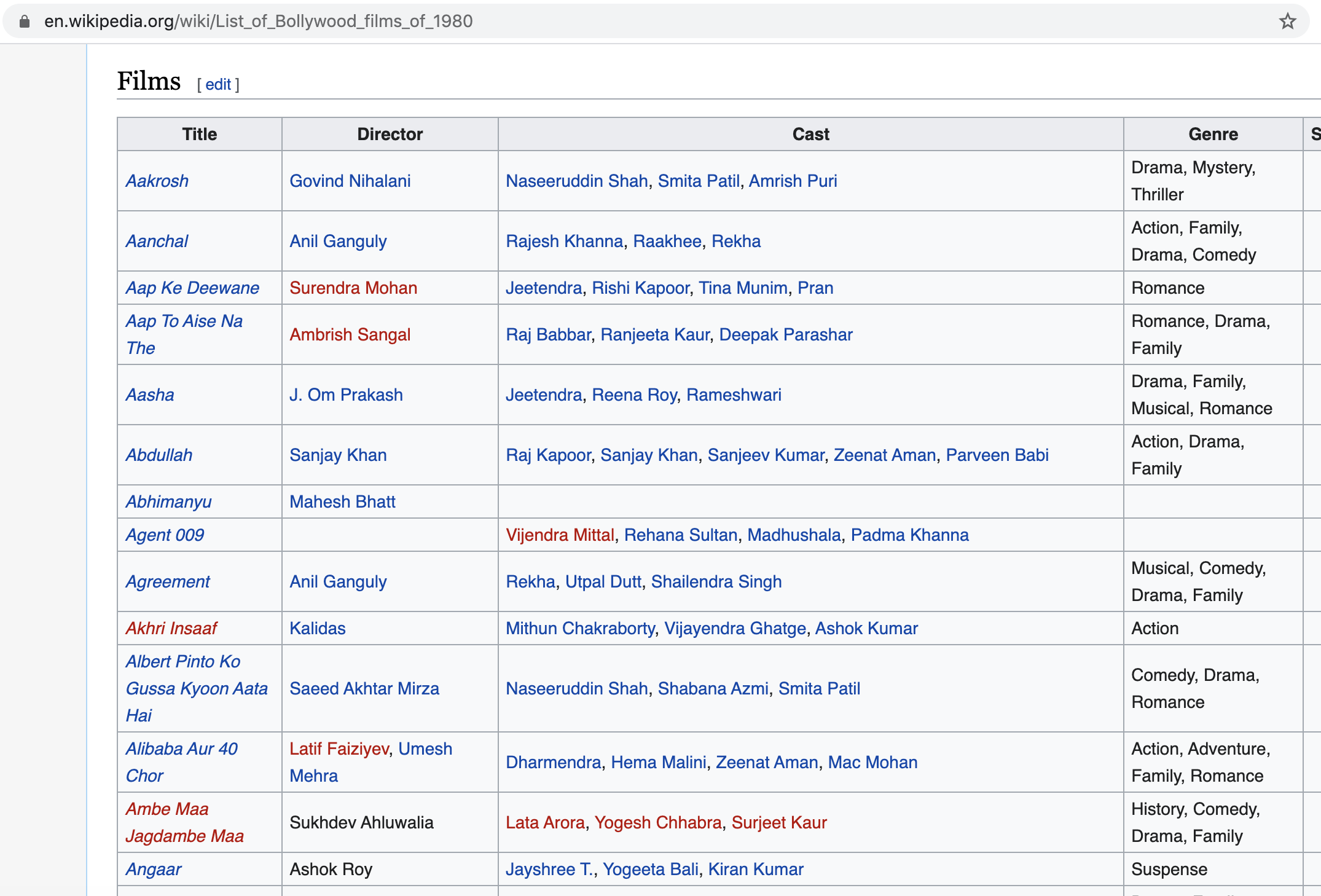
We use wikipedia as our source of data. Essentially we traverse through the list of films for each year and in the list, we further visit each film’s page. On the film page, we look for the songs list (or the soundtrack table). We do so for each film for the years 1933 to 2020. For example, here is the wiki page for the list of films for the year 1980:
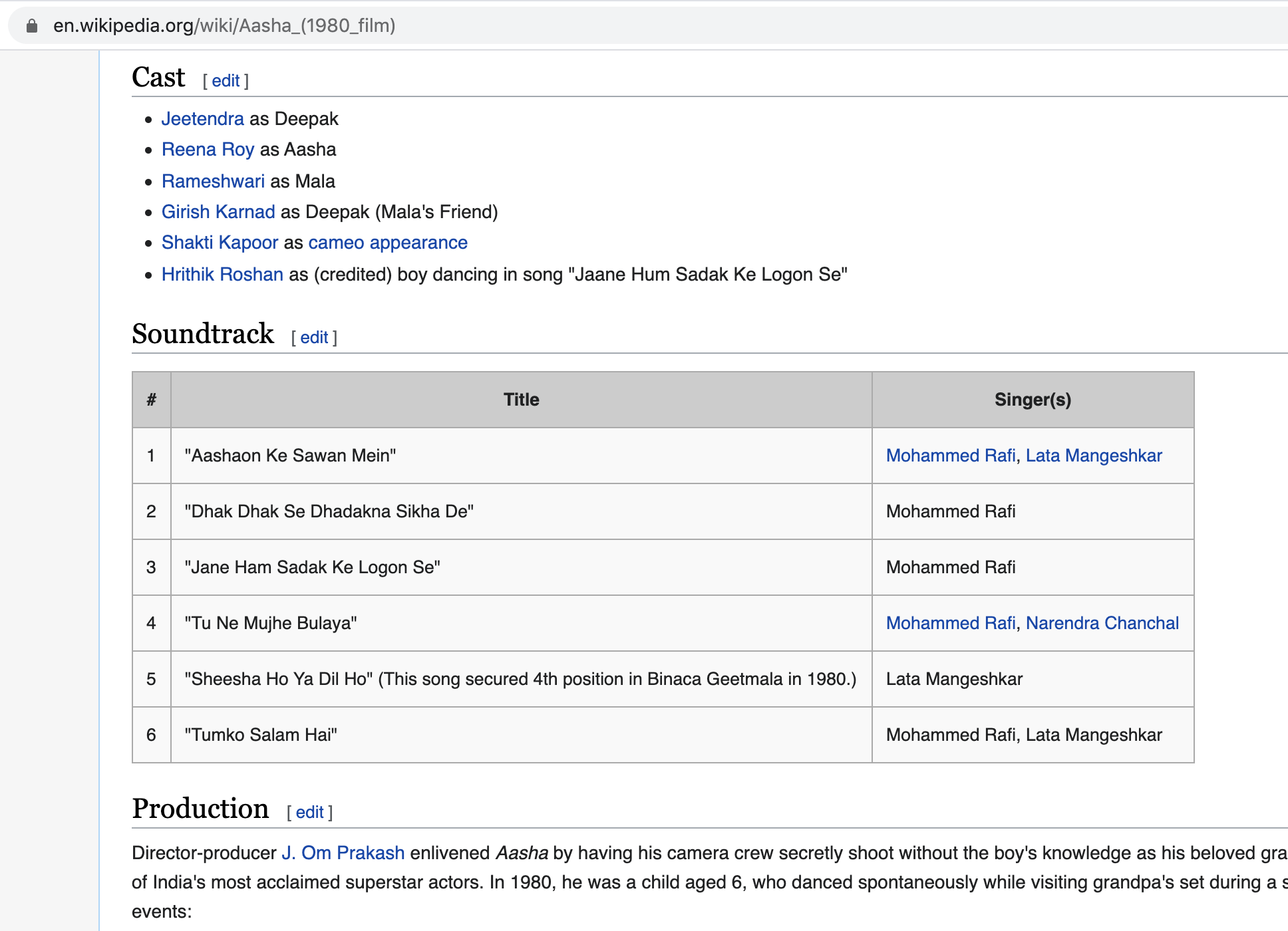
And here is the page of one film from this list of films, which also shows a soundtrack table:
As we can see in the first figure, the films are listed on a table, under the column Title. Using BeautifulSoup library in Python, we extract all the tables of this page i.e. elements with <table> tag, and for each table, we look for hyperlinks under the Title column.
We then scrape data from these hyperlinks (i.e. film pages) one by one, and using pandas library of Python, we read tables on these pages that have columns Singer(s) or Singer in them as can be seen in the second figure above. The relevant code snippet is as follows:
This is what we get as our final dataframe after this step:
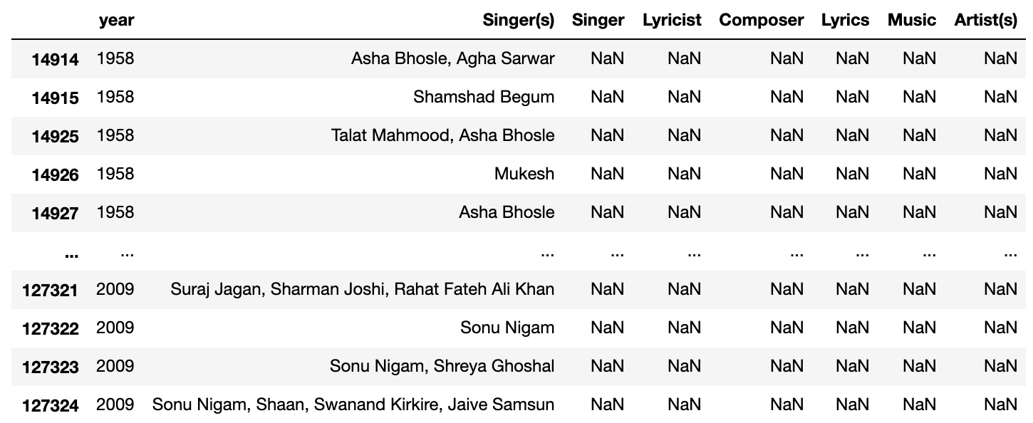
Note that there are other columns we tried to extract as well, but apparently, data does not exist for all the columns all the time. This indicates need for data cleaning/processing which we will do next.
Data Processing
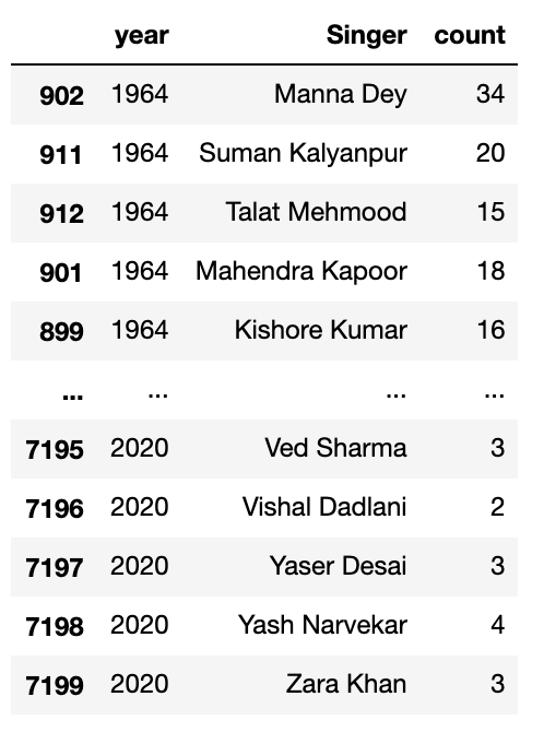
From the extracted data in the previous step, we need to get the count of songs for each singer for each year. Because Singer(s) column might contain list of names, we need to convert that string into list of names. Next, we need to explode the singer column such that each row has just one singer. Finally, we assign a count of 1 to each row and then groupby (year, singer) followed by sum of counts.
This shall shape the data as something like this:
We are all set to create the bar chart race !
Bar Chart Race
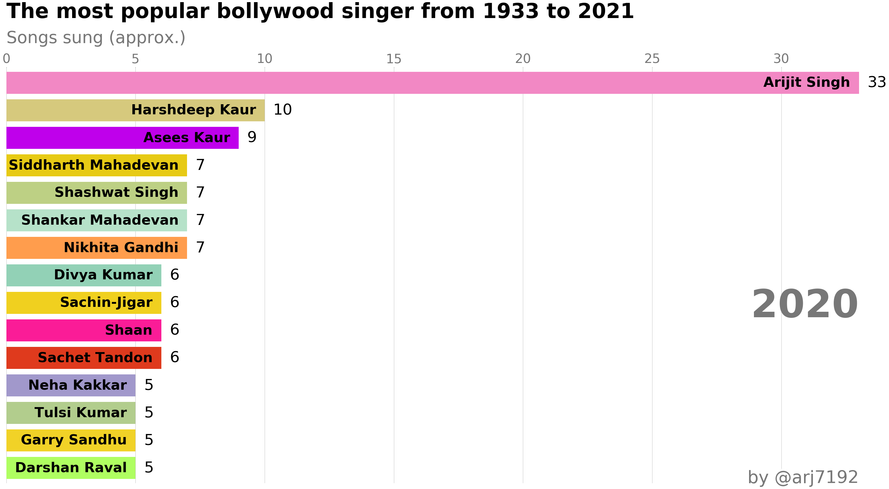
Using the dataframe from the step above, we will first generate a static barchart for a given year of data. This will be a horizontal bar graph showing top 15 singers (based on count) for that year. Once we have created the function for generating static chart for 1 year, we can use matplotlib’s FuncAnimation module to generate animated bar charts year-by-year. The function for generating static bar-chart is as follows:
The last line in this code shall generate the graph for year 2020, as follows:
Before animating the bar charts, we define a wrapper function specifically for singers over the above generic function. Once done, we can animate the bar charts. Firstly, the code for this section will look as follows:
The output animation should look something like this:
Conclusion
This is a quick and fun project which can be extended to other entities like Lyricists, Music composers, etc. I have done similar work for Directors and Movie Genres, however because the data is relatively less (a director directs far fewer number of films than the number of songs sung by a singer). The code for that exercise as well as the above demonstration for singers, including other scaffolding code is available at my github
Acknowledgements
Grateful to Wikipedia for being the amazing data source it is. I also took inspiration from this medium blog to scrape tabular data from wikipedia pages and the bar chart race code was mostly borrowed from another well-written medium blog.
Thank you for reading this post. Hope it was useful !